This isn’t a tutorial so much as it notes for myself regarding some of my recent experimentation in GIMP. The resulting images are garish, but I find them oddly compelling.
Here is a crop of a photo that I took from my driveway. The original photo was 6000×4000 pixels. I performed the various operations described below on the full size image. Only later, after I saw what the image looked like after doing various manipulations, did I crop it to 1600×1080. It is a kind of blah photo. Aside from the crop, I performed no other manipulations on this image. I should note, however, that it was one of the HDR images produced by my NEX-7.

Next, I performed one round of Gaussian Blur, Grain Extract, and Grain Merge on the photo. I used a blur radius of 50 because I noticed that I was getting a large halo around trees and along the skyline when I used large values. I still need to do more experimentation to find an optimal value. Alternately, it may be possible to mask the problem areas to avoid this issue. Here is the result:

In Easy Overprocessing with c2g, I found about GIMP’s c2g filter. I’ve tried the techniques described on that page, but haven’t yet gotten similar results. It may be that I’m missing a step. Another interesting article about c2g is How to Make Stylish Black & White Digital Photos with the GIMP. I’ve skimmed it and it’s worthy of further study. Another good article is Black and White Conversion with GEGL’s c2g (color2gray) in GIMP. It provides some very, very helpful hints on how to best set some of c2g’s parameters.
The c2g operation converts a color image to grayscale, but the resulting grayscale image can be much more striking than just using Colors->Desaturate… In GIMP 2.6.11, the c2g operation is found under Tools->GEGL Operation… From there, a dialog will pop up, at which point,you need to select c2g from the menu. Here is what the crop looks like after subjecting the entire 6000×4000 image to c2g with Radius=500, Samples=10, and Iterations=10.

Here is what a desaturated image looks like using Colors->Desaturate… I ended up using a portion of this image for the sky.

The c2g version appears to have more texture to it. The sky, however, turned out to have too much texture for my taste, so I created the second version to use for the sky alone. I applied a layer mask containing only the sky to that layer and an inverted mask to the c2g layer. With the masks applied, I set the layer mode to Grain Extract for both of these layers. Here’s what that ends up looking like:

Note that the sky has a fairly smooth texture to it, but the buildings and even the street appear to have a significant amount of texture.
Next, I duplicated the blur-extract-merge layer that I started with, put it on top of the layer stack, and set its mode to Grain Merge. Here’s the result with those four layers visible:

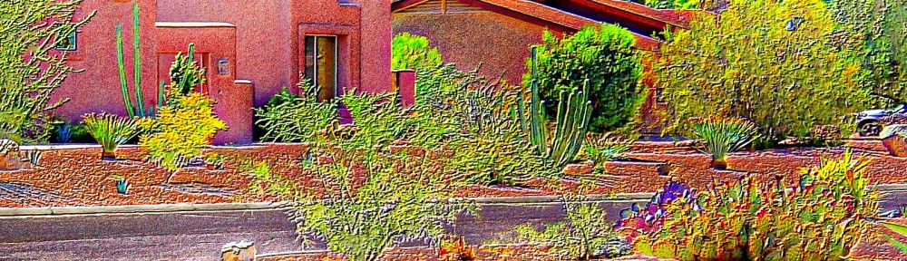
This might actually be a good place to stop, but I decided to see what it looks like by duplicating the two grain extract layers and the top-most grain merge layer and then placing those layers in the correct order on the top of the layer stack. Here’s the result:

Performing another round of duplicating the grain extract and grain merge layers and placing them at the top of the stack produces this image:

I wanted the sky to be a deeper blue, so I added a grain extract layer of the desaturated sky with the opacity set to 71%. Here’s the GIMP layer window for the upcoming image:

Below is the final image. It may be that one of the earlier images is “better”, or maybe they’re all just awful. I’m too close to it right now and probably need to look at the whole thing again in a few days. It is interesting though to see the variety of contrasting colors obtained using this technique. At no stage in the process, except for the last step where I fiddled with the sky color, did I actually choose any of those colors. They just came out on their own by iterating grain extract / merge operations on the grayscale image produced by c2g.
