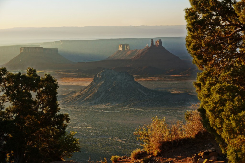
Marilyn took this photo of Castle Valley.
Although I really like this photo, I’m am not quite satisfied with my editing of it. I split the photo up into four layers, the sky, the towers in the background, the tower closer to the foreground, and the foliage in the immediate foreground.
It’s those trees in the immediate foreground that gave me the most trouble. The original photo had some haze or something that I was able to de-emphasize for portions of some of the layers. But when I used the Curves tool on the foreground foliage, that mist or haze near the edges of the leaves ended up getting lit up and looked really bad. I ended up making a fairly large selection around the trees and feathered it. When I was done, I still had a bunch of mist around the trees, but it faded into the layer underneath. I still didn’t like the look of it though, so I used one of the “Circle Fuzzy” brushes with the opacity set to 30% to remove some of that haze by painting black into the layer mask.
The tree on the right and left still have a sort of nimbus around them, but when I look closely, I can see that in the original photo too.
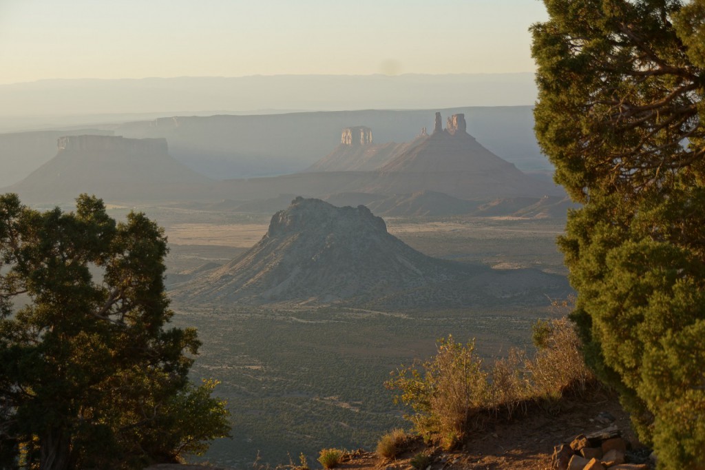
Here is the original photo. The only modification performed on it was that it was scaled for uploading to this site. (The site software performs additional scaling of its own.)

