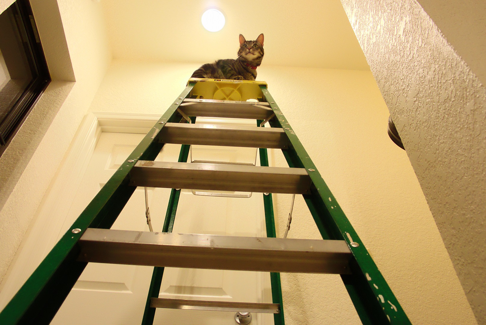
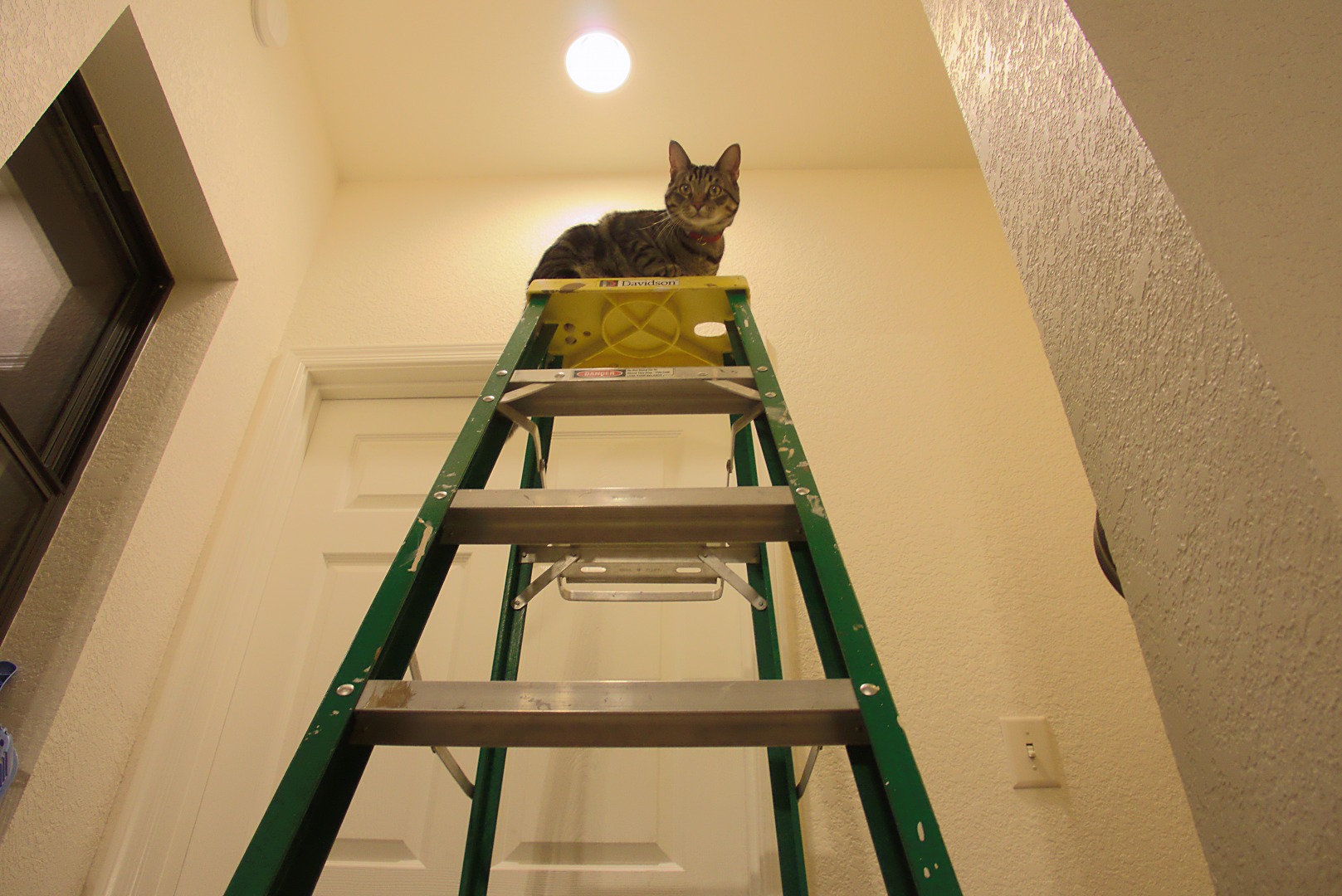
Marilyn got out a ladder for changing a light bulb late this afternoon. Tiger climbed the ladder while she was disposing of the old bulb…
The exposure I used for this photo was shot at f/8, 1/15 sec, ISO 1600.
I processed the RAW file from the camera three times, once with a very low exposure compensation setting for the lightbulb, another time with a somewhat higher setting for the bright areas of the ceiling and the walls, and a third time for everything else. I created a tone map layer, but ended up not using it as it had too much noise due to the image being shot at ISO 1600. I could have processed created the image with noise reduction on the RAW file conversion, but it didn’t look to me like it’d add enough interesting detail to bother.
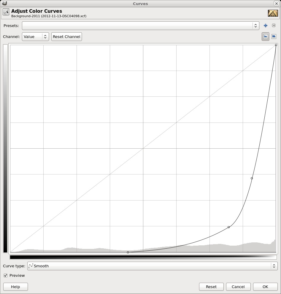
I blended the two brightest layers by making a copy of the very brighest one and running curves on it. I used this curve:
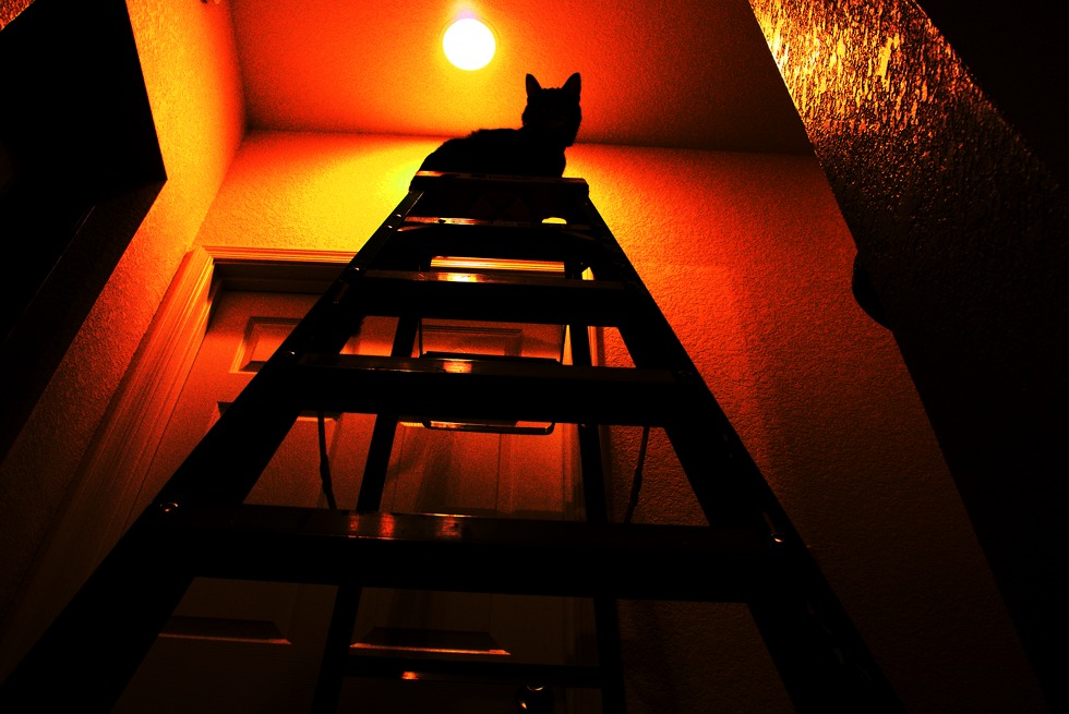
With that curve in place, the (copy of the) bright layer looked like this:
This is an interesting image in its own right, but I wanted to use it to create a layer mask for the second brightest layer. To do that, I created a layer mask using a grayscale copy of the layer. This is one of the options when creating a layer mask. I then converted that mask to a selection and used that selection for creating a layer mask on the second brightest layer. This removed most of the blown out areas of the image and gave it a more even tone. It’s still bright on the ceilings and walls, but the texture is now evident.
For the light bulb layer, I adjusted the exposure compensation so that the right end of the histogram was entirely contained in the graph. According to ufraw, there were no overexposed areas.
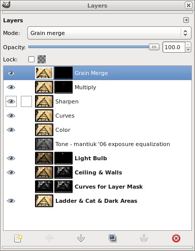
This is what the layers window looked like when I was finished:
The fourth layer down, a Curves layer, was used to eliminate an empty spot at the left edge of the histogram. This improved the overall contrast somewhat.
I duplicated the Curves Layer and ran the unsharp mask filter to sharpen the image.
I usually stop after sharpening, but I thought that the cats face was too washed out, especially on the left side (his right side) due to the light. So I created the Multiply layer to darken that area and then a Grain Merge layer to add even more contrast to certain parts of his face and body. I simply painted white into a transparent layer mask where I wanted extra darkening or contrast. I used a fuzzy brush with the opacity set at only 10% so that each brush stroke would only have a small effect. If I didn’t like the result, it was easy to undo that stroke or even several strokes preceding. (If I really hated it, I could have deleted the layer mask and started over with a fresh mask.)
The only layers that directly contribute to the final image are the top three layers. The other, lower, layers were important as intermediate steps, but I could disable the visibility of these layers without affecting the displayed result. I keep them enabled when I save the XCF file, however, so I know which layers are important when I open the file back up again. I will sometimes tweak some of those lower layers and then recreate the upper layers with the new settings.
A similar shot, but taken from slightly higher up:
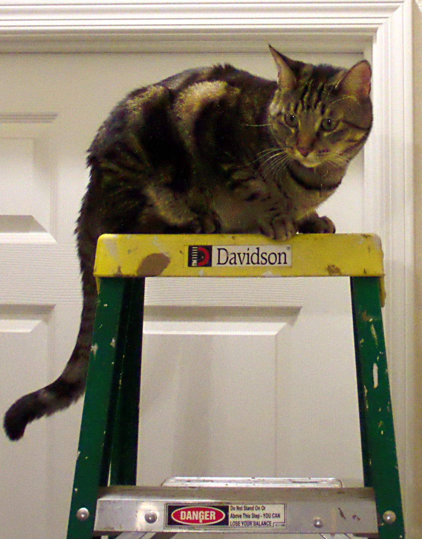
Cats do not heed ladder safety warnings:
