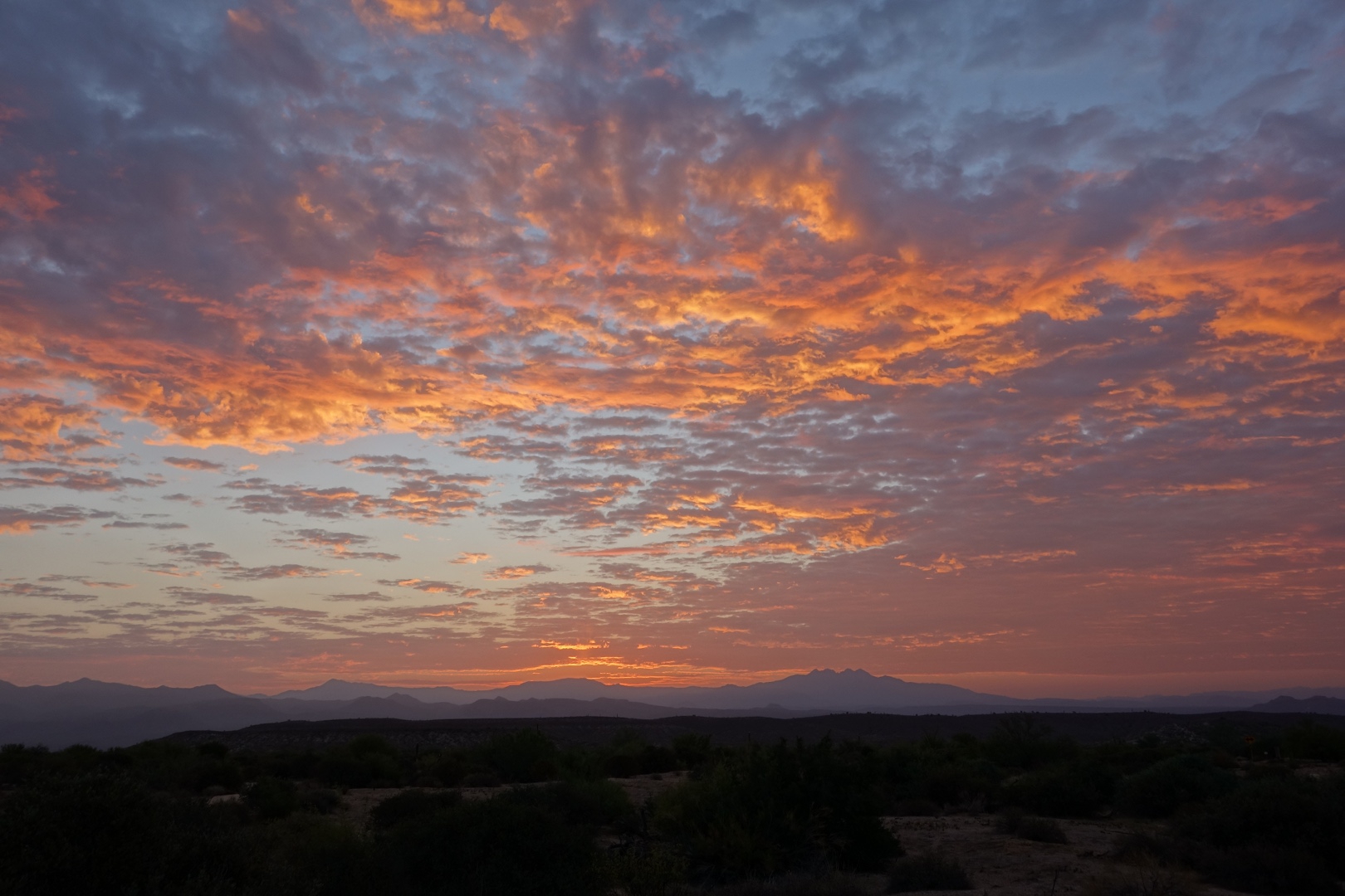
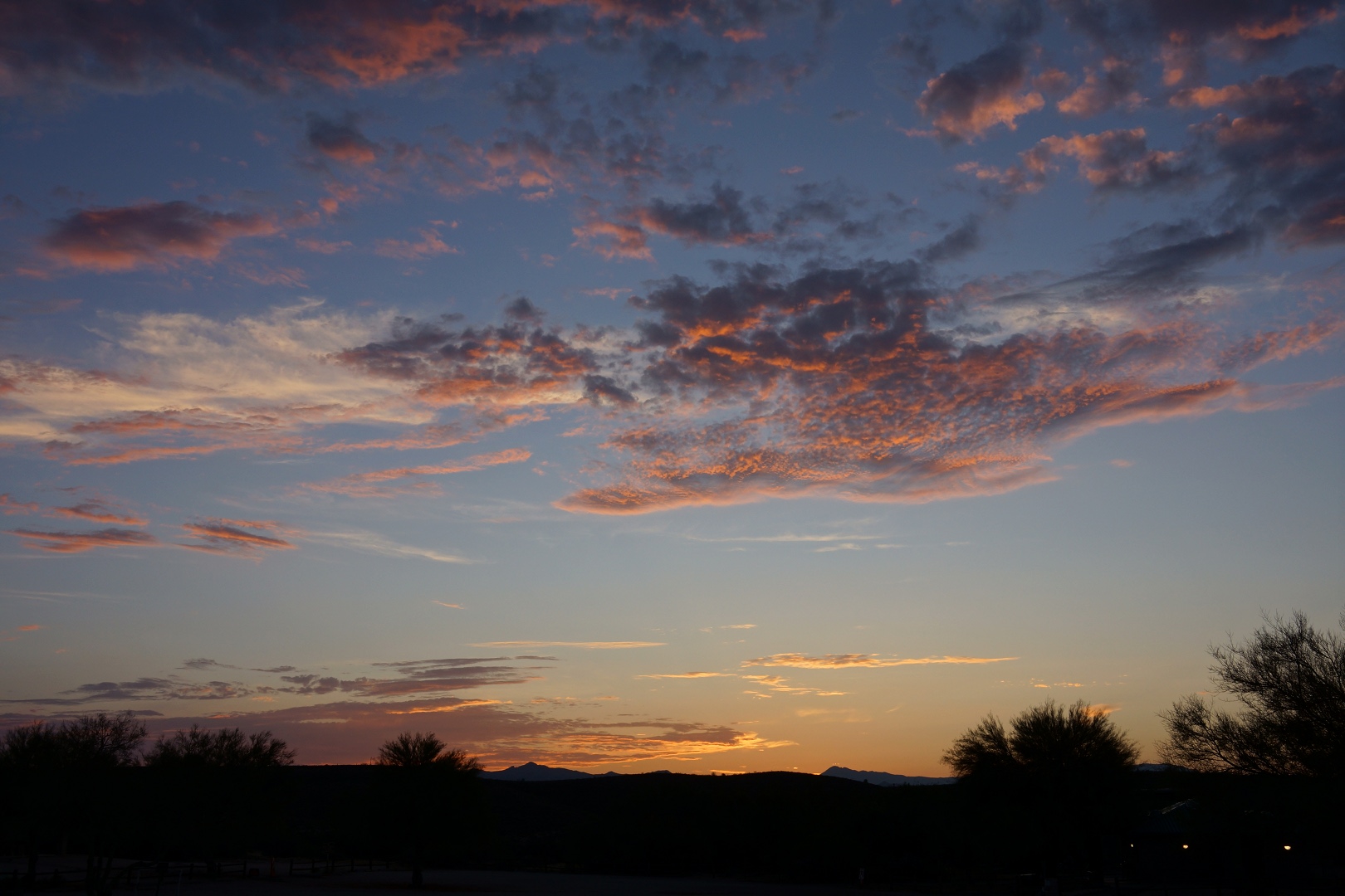
I’ve been trying the Mantiuk ’06 tone mapping operation on some of the photos that I’ve edited in the past to see what additional detail might be revealed. In both of the photos below, the foreground was very dark and, in my original edits, I wasn’t able to do a satisfactory job of showing the foreground detail.
I first posted this one on August 31st. Here’s a link to the original edit for comparison purposes. The original was cropped somewhat, whereas this one is not. The differences in the foreground detail between this version and the original are not that profound. I think the color of the bare ground looks better in this one as does the detail in some of the foliage.
This one, below, was first posted on July 20. Again, here’s a link to the original edit. Again, the crop is different on the new edit – it’s uncropped. The original showed the trees and the foreground as a silhouette. This one shows considerably more detail. Using the editor, GIMP, I zoomed in an looked at the area near the orange cones. I could almost read the sign sitting along the fence just right of the cones.
While talking to my Mom about these photos, she thought it’d be interesting to see what the out-of-camera versions looked like with no edits (aside from being scaled for upload to this site). Here they are:
August 31st original:
July 20th original:


